Responsive website design from strategy to developer-ready Figma. Multi-page layouts, component design, and full handoff documentation.
4-6 weeks from kickoff for standard Growth scope. Figma source + export package on delivery.
The first thing we do on any website project is figure out the information architecture. What pages exist, what goes on each one, how people move through the site. We do not start designing until the content structure is agreed. This prevents the most common problem in website projects: pages that look good but do not communicate anything.
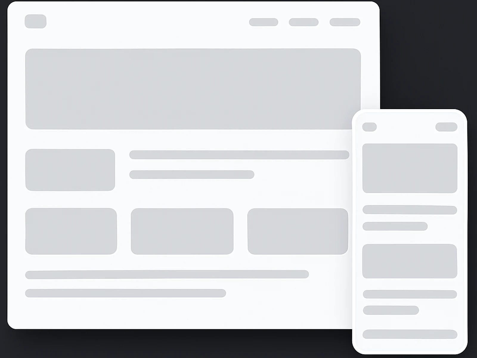
We design mobile-first. Every layout starts from the smallest viewport and works upward. In practice this means fewer responsive breakage problems at handoff and a design that actually works on phones, not just on the MacBook screen we designed it on.
Every page design comes with a component library in Figma. Buttons, cards, navigation states, form fields, headers, footers. The developer gets named components with documented properties rather than a collection of artboards. This reduces implementation time considerably and reduces the chance of inconsistencies between what we designed and what gets built.
Website design does not include development or coding. We deliver design files. We do not build the site. We work well with your internal developers or can recommend external development partners depending on your tech stack.
We design in Figma for any platform. Whether it ends up in Webflow, WordPress, custom code, or Shopify, we deliver assets and specs that work. We can tailor component structure to match specific platform constraints if needed.
Two rounds of revisions on each page design are included in the Growth package. We define what counts as a revision in the project brief before work starts.